Our First Blog – We’re Rebranding!
Oh Hey! It’s the new WRRC!
Excited? Us too. Let’s get started.
Our new brand, logo and website are all designed with a few things in mind.
1. We’re a progressive, feminist agency dedicated to supporting women while they change their lives.
2. We want to change the world.
3. We want you to help us!
One of the ways we thought we could achieve our goals listed above is through a new, community inclusive website. The content is for everyone – whether you’re a woman seeking shelter & support, someone who wants to get involved in activism, or if you just want to chat about gender-based violence and feminism, we got you covered.
A Few Thoughts on the New Logo
We worked with adHOME Creative on our rebrand. They were awesome-sauce. Seriously work with them.
As an organization, we really wanted to bring our brand into the 21st century. We felt our colours and the logo itself looked very dated, and didn’t represent what we felt on the inside. Working with adHOME, we came up with a list of personality traits for WRRC that they took away and designed our logo around. They were:
- Compassionate
- Progressive
- Bold
- Creative
- Brave
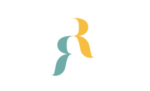
They came back with four amazing designs, but ultimately, this is where we landed:

So cool right? They started by taking the two “R”s in WRRC and combing them to form a single character with two states of mind. But it goes much deeper than that. This is some of the meaning behind it, from the designers:
“One is sitting lower, reflecting on the past and the other sitting elevated, looking towards the future. This represents the positive and uplifting journey women experience when they become involved with WRRC in any capacity. Whether in need of physical shelter or simply a place to discover a community of women inspiring other women, we have something to offer. It also reflects the inner journey a person goes through as they grow within themselves, respecting and acknowledging who they have been while they work towards the goal of who they want to be. Finally, the upward momentum created by the figure serves to underline our overarching goal of raising women up and promoting the feminist movement.”
Swoon. Love it.
Navigating the New Site
So you’ll notice this was a complete overhaul of our website. There are some similar features (like the Quick Escape button for safety), and we still tell you about what exactly it is we do, but other than that, it’s very different. We worked with adHOME to ensure the usability of the site was as intuitive as possible. We invite you to explores some of the different sections, and read through some of our new content. It’s up-to-date, more approachable, and of course, if you need more information you can call or email us at any time. Some of the different sections of note:
- About us – all new! Check out some of the awesome staff at WRRC, what we do, and a little bit of our personalities.
- What we Do – from the moment you first engage with WRRC (however you choose to do that) you are in control of your life, and your narrative. We are there as allies to support you and your decisions. Every choice is up to you. In this section, we outline some of the services we offer that you may be interested in.
- Learning & Resources – there’s such great stuff in here. From other rural women telling their stories of hope and healing, to some of the latest research on gender-based violence, to news and events from WRRC, and more, you’ll definitely want to spend some time here.
The Blog
We want to talk about this very blog, since it’s one of the areas we’re most excited about. We want this website to be community oriented, and we’re always looking for content. If you have something you’d like to write about, we’d be happy to discuss the topic with you and invite you to be a guest blogger with us. You’ll notice we have a few guest blog posts up already, from volunteers in our community. We’ll also include things like poems, art pieces, video from some of the women and children working with us if they want to share. You can also SUBSCRIBE to our blog, so you’ll get notifications in your inbox. Please do this. We love talking to you.
Finally, Thank You
None of this would have been possible without the continued and unwavering support of our community. It’s our hope that this new site will allow us to better connect with you, and keep you up to date on what we’re doing, and the projects we’re working on. So once again, thank you. Let’s chat again soon.
back
